Visualisation of scientific data is an integral part of scientific understanding and communication. Scientists have to make decisions about the most effective way to communicate their results everyday. How do we best visualise the data to understand it ourselves? How do we best visualise our results to communicate with others? Common pitfalls can be overcrowding, overcomplicated plot types or inaccessible color schemes. Scientists may also get overwhelmed by the graphics requirements of different publishers, for presentations, posters etc.
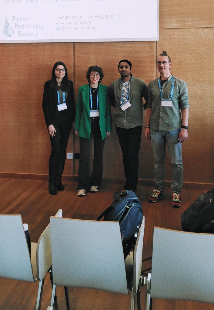
During the conference EGU23 held in Vienna, the Short Course “DataViz: Visualise your data effectively and avoid common pitfalls” was delivered. This course was co-organized by the Young Hydrologic Society (YHS) and was designed to help scientists improve their data visualization skills in a way that the research outputs would be more accessible within their own scientific community and reach a wider audience.


Topics discussed include:
- Choosing a plot type – keeping it simple
- Color schemes – which ones to use or not to use
- Creativity vs simplicity – finding the right balance
- Producing your figures and maps – software and tools
- Figure files – publication ready resolutions
The course materials (slides + Panoply video tutorial) are available below.
Video tutorial of Panoply: LINK
The presenters can be contacted vie e-mail for any questions and follow-ups.
- Swamini Khurana, swamini.khurana@gmail.com
- Edoardo Martini, edoardo.martini@uni-leipzig.de
- Paola Mazzoglio, paola.mazzoglio@polito.it
- Epari Ritesh Patro, erpatro@gmail.com
- Roshanak Tootoonchi, roshanak.tootoonchi@unitn.it