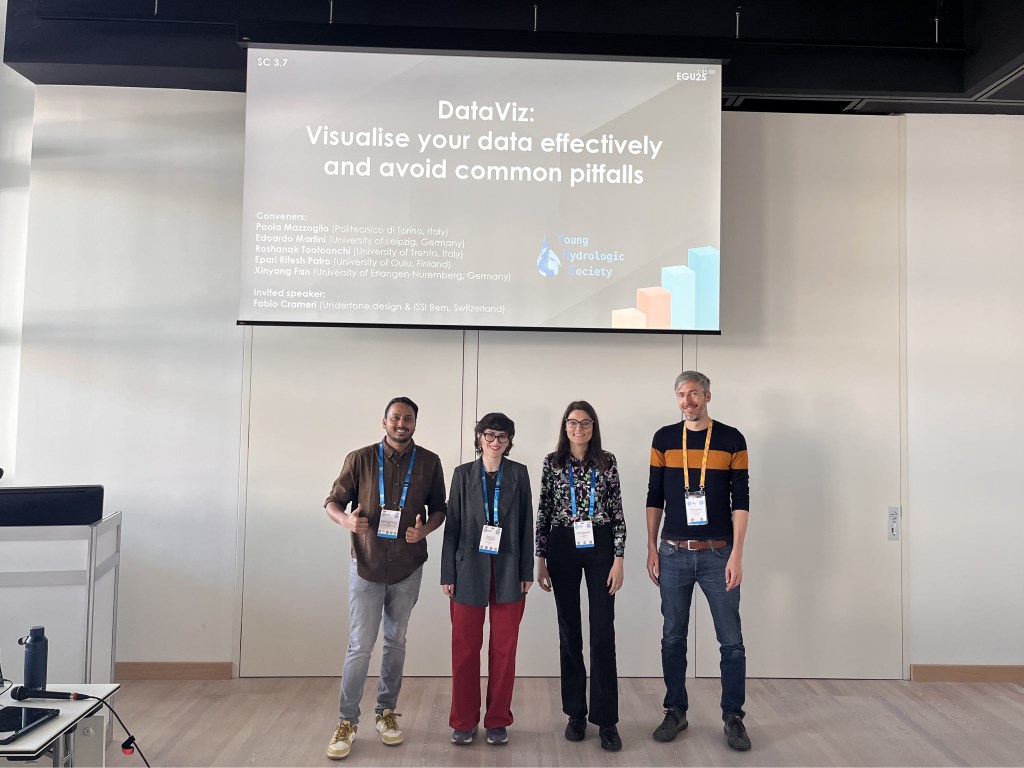
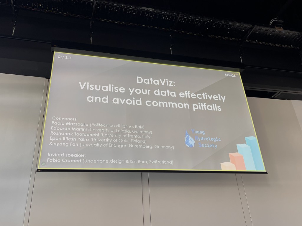
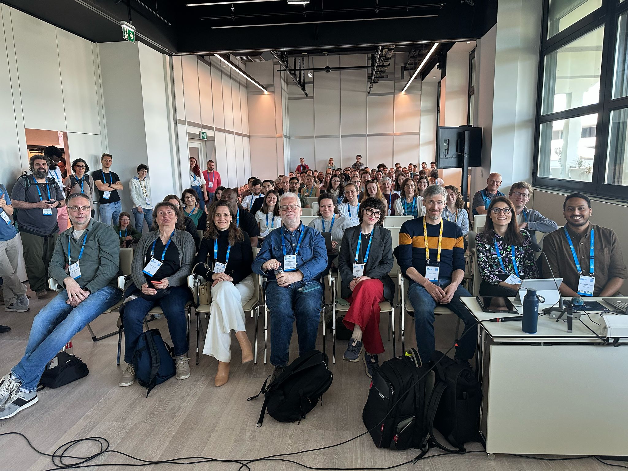
During the EGU General Assembly 2025 in Vienna, the short course “DataViz: Visualise your data effectively and avoid common pitfalls” was once again delivered by the Young Hydrologic Society (YHS). Now a well-established tradition at EGU, this course is designed to equip early-career scientists (and anyone interested) with both inspiration and practical tools to enhance their data visualization skills. In a time when visuals often speak louder and travel faster than words, the ability to create clear, accessible, and visually compelling graphics has become an essential part of scientific communication!

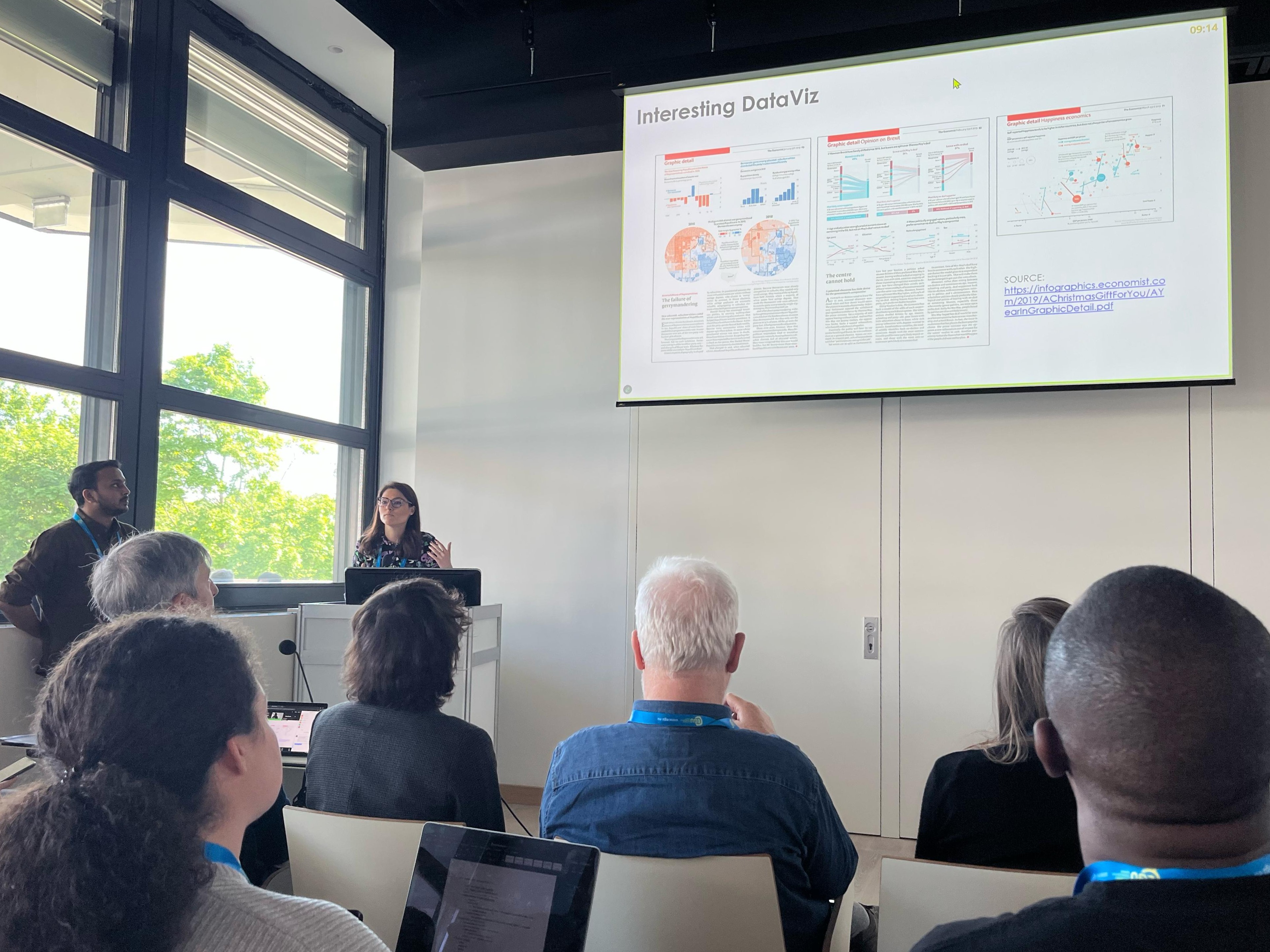
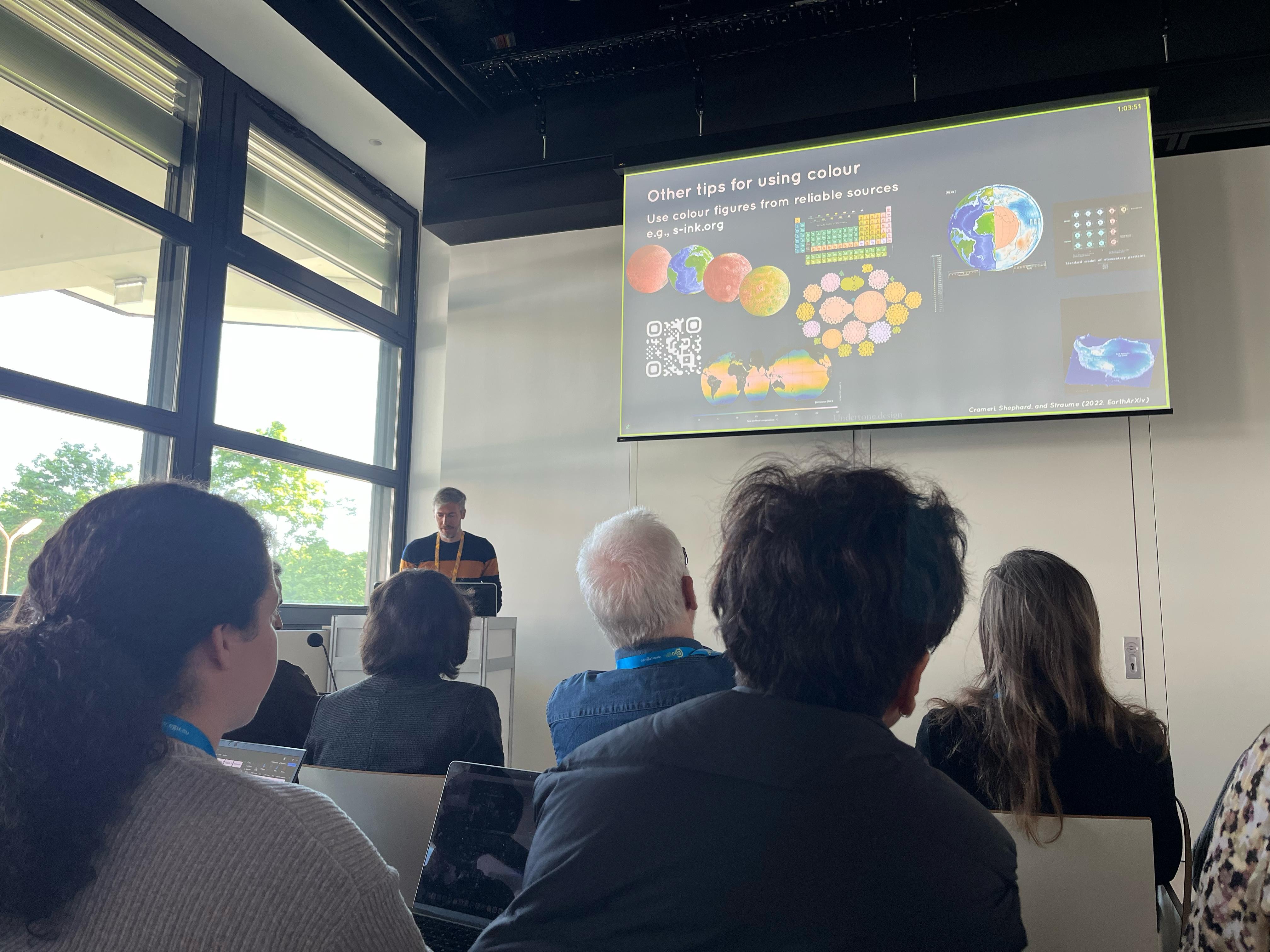
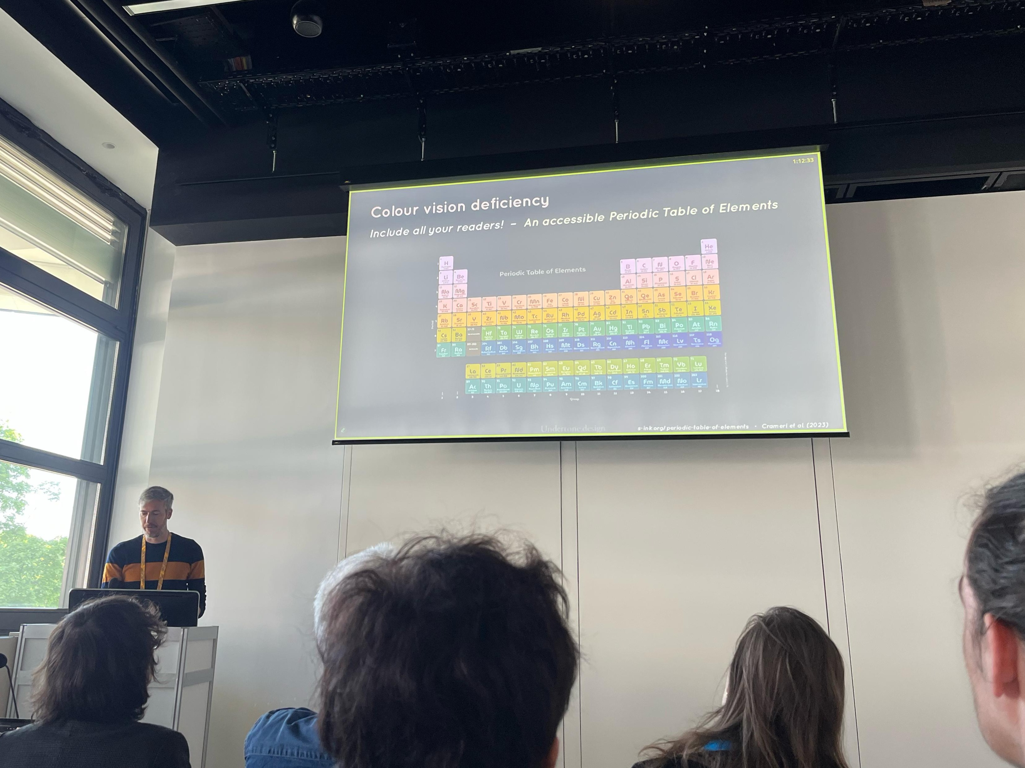
The short course began with a brief history of data visualization, highlighting key milestones and figures who shaped the field, followed by an overview of core principles for effective DataViz. A dedicated segment on colour schemes explored accessibility, aesthetics, and common pitfalls in choosing palettes. The course then introduced practical tools such as Climate Data Operators (CDO) and Panoply for visualizing climate-related datasets. A section on AI tools for DataViz showcased emerging technologies that can streamline figure creation and enhance impact, while another focused on publication compliance, including tips on meeting journal standards.


The course materials are available below.
The presenters can be contacted via e-mail for any questions and follow-ups!